


Plume
An e-commerce business created utilising AI automation and print on demand.
AI Art & automated Ecommerce
AI is something that really interests me, and in my free time I have been learning all of the various generative AI platforms. After playing around with Midjourney and the like, I eventually graduated onto a locally hosted Stable Diffusion instance with ComfyUI, which allows for much greater control over results by building and customising your own generative pipelines. It is also much better for consistency and learning, as you're building the model rather than relying on a black-box AI.
In 2025 I decided I might as well capitalise on my learning, along with my visual design and Photoshop skills, and create a wall art shop.
Key points
- Created a small business selling poster designs that I designed, generated with AI, or restored.
- Joined up with a printing and framing firm for fulfilment so that I could focus on what I'm good at.
- Completely automated business generating a passive income - I was keen to not need involvement day-to-day.
- Over 1000 designs completed to date, largely achieved through automated AI pipelines.
-

-
Results
-
-
-
-
Accord Mortgages
Product design for an online B2B Intermediary mortgage lender
Website redesign
In 2017 I redesigned the Accord website on my own after researching the pain-points of the existing site, and with a team of content designers and developers led the build of the redesign.
Key points
- Usertesting and interviews with over 50 brokers to understand their behaviour
- Held workshops to gain insight and buy-in from internal stakeholders
- Identified key drivers to the website and formulated designs to address key issues
- Aimed to make the information and processes easier to find - increasing conversions and reducing calls into the business
Before

After

Results
Conversion rate
Call reduction
Awards
-
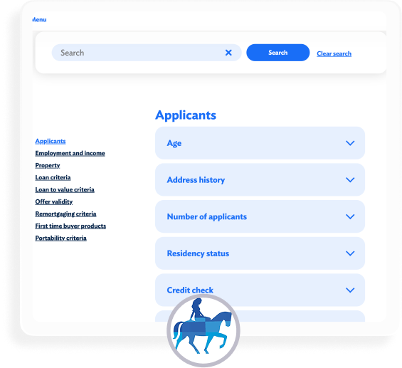
Lending criteria
Lending criteria is one of the key drivers of users to the Accord website, where brokers refer to lending policies for their clients' circumstances.
In 2024 I researched and redesigned the lending criteria tool.
Key points
- Thoroughly researched the tool and its place in wider broker journeys
- Designed a criteria finder which allows brokers to find very specific information as well as see everything on broader topics with ease
- Used SME knowledge from Policy teams, Risk teams and Underwriters to completely rewrite and restructure the lending policy itself
- Formulated a one-to-many criterion asset system with content developers to avoid duplication of content, and allow for much easier maintenance of the knowledge base in the CMS as it naturally evolves over time
Before

After

Results
Conversion rate
Call reduction
Criteria use per session
-
Yorkshire Building Society
Product / UX design for a mutual financial institution providing mortgages and savings products.
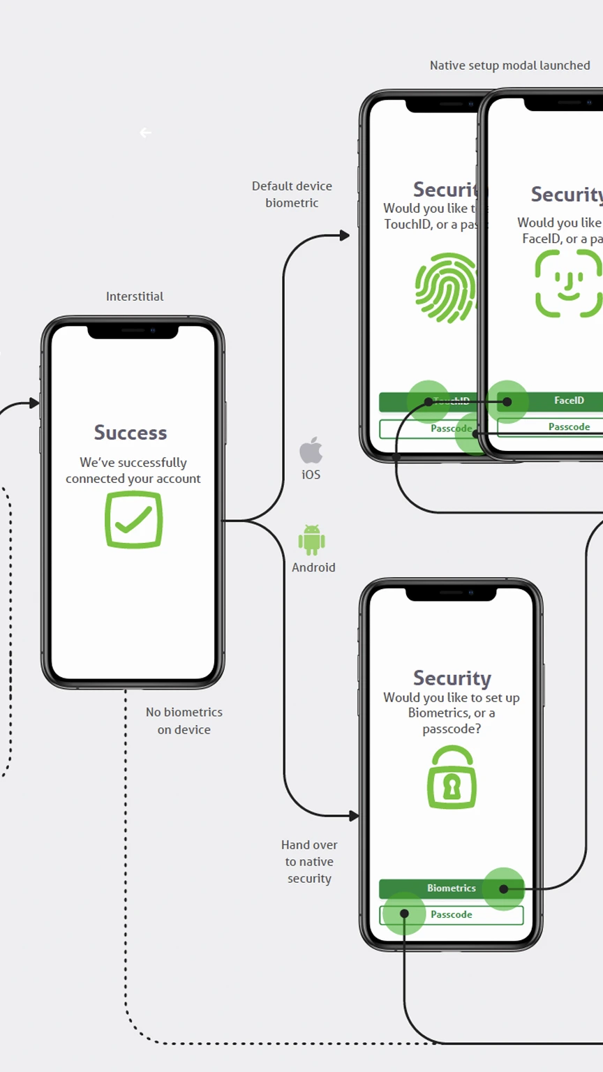
Launch of a Banking app
In 2020 YBS launched their first mobile banking app, allowing customers to manage their savings accounts on a native application.
The building society was going through an intense period of digital transformation when this project began, and I was keen to be the voice of the user and champion UX in the process.
Key points
- Designed and prototyped the app from the ground up as the sole designer
- Created an offshoot of the YBS design system for native apps
- Worked with developers to design our way around complex limitations stemming from connecting modern APIs into legacy banking systems
- Created custom Lottie animations for various messaging screens
Website redesign
In 2020 I redesigned the Yorkshire Building Society website.
Key points
- Researched the site to identify pain-points for users, and weighed this against areas most ripe for conversion increases
- Designed the site from the ground up, and developed many of the components
- Created a custom-built design system which allowed content editors and developers to copy code directly from each element
- Led a team of content designers and developers in building, migrating, and content-designing the site from scratch
Before

After

Results
Mortgage conversion rate
Mortgage application approvals
Savings conversion rate
Savings application submits
Navigation
Over my time at YBS I often revisited some key areas which are best placed for good conversion increases. One of these areas is the navigation.
Because the navigation is so heavily used and appears on every page of the site, the impact of just reconfiguring, testing, and pushing for simplicity can be oversized.
Key points
- Several rounds of split testing to drive conversion rate uplift
Before

After

Results
mortgage conversion rate
savings conversion rate
-
-
Fenrir
An e-commerce business selling high-end Faux fur throws.

E-commerce brand
In 2020 I decided to start an online business. After researching potential products to sell I landed on luxury faux fur throws.
I chose higher-ticket products as I considered value-based e-commerce to be saturated, and I wanted to task myself with creating a luxury brand which could command higher sale prices. Outside of some copywriting and videography work, I created everything myself.
Key points
- Created a small business selling faux fur throws
- Managing 20k pa online advertising budget
- Largely automated business through XML feeds and APIs
- Enjoyed some national media exposure on TV and magazines
-

-
Results
Revenue
Conversion rate since launch
ROAS
Retailers
CV
I'm a motivated UX / Product designer with over 10 years of experience designing intuitive and engaging experiences for users that meet business goals.
Work experience
Yorkshire Building Society Group
2020 - UX Designer
- Increased both online mortgage and saving application conversions by 25%+ with packages of work initiated and led by myself.
- Leading split test experimentation across squads.
- Collaborated with product managers, developers, and stakeholders to design and deliver user-centered digital products
2017 - Design lead
- Led the design for the original YBS mobile app.
- Led redesigns of the YBS (B2C) & Accord (B2B) brochure sites, which led to 73% and 15% uplifts in conversion rates respectively.
- Created the YBS Group design system in use today.
2015 - Web Designer & Developer
- End-to-end UX research & design, and front-end development.
- Developed various complex financial calculators.
Norwich & Peterborough Building Society
2015 - UX Consultant
Fixed-term contract with a key role in redesigning and re-platforming the N&P website.
Stoic Media
2014 - Digital designer
- Branding and digital design work for a range of clients
- Developed tools & original content to help businesses grow.
SQ Digital
2013 - Web designer
Designed brands, design systems and websites for a range of SME’s whilst also handling all client communications at a high-pace agency.
Education
Lancaster University
2009 - LLB Law
Core skillset
- Understanding business goals and achieving them through design
- Lateral thinking to solve complex user problems
- User flows and prototyping
- Visual and interaction design
- User research and testing
- Information architecture and content design
- Design systems and style guides
- Working in an Agile environment
Tools

Case study: Design process
I've deliberately chosen a fairly simple subject matter, Accord Lending Criteria, to demonstrate my UX process; it's a glorified Knowledge base, and leans towards IA/UX content, but it's easy to follow and a good example of how the process can bring order to chaos.
Aim
Accord’s Lending Criteria tool serves as a critical resource for brokers, enabling them to quickly verify lending policies and determine mortgage eligibility.
Triggered by anecdotal feedback and high call volumes for basic criteria information, this project was launched to improve the broker experience.
The redesigned tool aims to:
- Reduce friction
- Lower support calls
- Reinforce the ease of doing business with Accord
Heuristic review
I conducted an initial audit of the tool, quickly identifying some potential usability issues, particularly around:
- Navigation inefficiencies: Long lists that lack meaningful categorisation
- Inconsistent naming conventions: A-Z but strange naming conventions eg Income is called Acceptable forms of income
- Content fragmentation: Key information dispersed across several pages and requiring multiple clicks
Broker interviews
Because I'm dealing with a B2B site dealing with a very particular cohort, I allow some time to chat with the end-users. This is very informal and I am happy to ask leading questions or follow up with subsequent interviewees on issues raised. I am basically trying to get into the mind of this type of person and understand what is important to them.
Whilst I think the purest form of data is task-based testing, or better yet split testing, I think this sort of qualitative data can be particularly helpful when the user-base is very particular.
In this instance, for Accord, I knew from experience that the majority of the brokers would report that everything was 'fine' and perfectly serviceable: The bar for intermediary lender sites is quite low, and Brokers undoubtedly gain familiarity with the quirks of different lenders interfaces. Nonetheless, I know there will be nuggets of critical information in the answers.
When do you use the Lending Criteria page?
- Every time I have a client which I’m recommending accord product to.
- Easy to navigate and find what I need. Lots of information on there. BDM and helpdesk team are always really helpful when needing something more in depth.
- Not very often, Angelika has usually covered most of the important criteria in our BDM meetings. When I do use it, is for small criteria points like max ltv etc
- To check all types of criteria from the acceptance of different types of income, interest only criteria, acceptable properties.
- If I have a non standard case or they have had credit problems in past
- I use Criteria Brain to filter out lenders who are unwilling to lend due to their criteria and then verify criteria on the provider site directly as Criteria Brain information can be inaccurate.
- Complex cases, income details, general criteria queries
What do you think about navigation on the page?
- The pop ups asking are you a broker etc are a little annoying it would be great to just click on the page you want without closing the 2 pop ups
- Far easier and smoother than a lot of lenders.
- I like the new page, the search works well
- Search facility is poor. For example if you type in commission it just brings up tabs which you have to click on again rather than take you direct to relevant text.
- Fine
- Easy enough
- Website is very user friendly
- One of the better criteria search pages
- Fine
- Straightforward to use
What do you think of the design of this page?
- Easy to follow and appealing on the eye not overwhelming.
- Easy to use and find information, alphabetical to speed up the process but also not TOO much so that you’re there forever scrolling
- I like it, easy to read and navigate
- Fine doesn’t need to change
- Its very well laid out everything is easy to find
- Lovely
- Fine, nice and smooth
- Fairly user friendly
Can you easily locate the information that you need? If not, why not?
- Yes its transparent
- Yes, very easy to find information
- For the most part yes, there will always be things that need human intervention. But overall very good
- No needs to be more comprehensive not enough information around acceptable properties income types etc.
- Yes
- Yes
- Easily found for 90% of queries
- Yes
- Good for generic information, can sometimes struggle for specific one off criteria (which is to be expected)
What do you do if you can’t find information that you are looking for?
- Call or email BDM 99% of the time or sometimes try live chat but this is often very busy and takes a while.
- Ring BDM, live chat or helpdesk
- Call BDM
- Call
- Use web chat
- Call BDM
- Call/email Charlie – always extremely helpful, approachable and knowledgeable
- Call BDM
- Ring Charlie
When you find the information that you need, is it easy to understand?
- Yes everything is explained well.
- Very easy to understand
- For the most part I find what I need and can understand it
- Not bad but sometimes could be clearer perhaps some examples.
- Yes
- Yes
- Yes
- Yes, I think so
- Yes
Would you like more information on the page? If yes, what information/support would you like to see?
- No but more staff on live chat would be more helpful.
- No, I think all of the information in the majority is there and anything further there is always BDM or helpdesk support
- No
- The more the better. Would much prefer to wade through criteria to find information rather than call in.
- It can be limited so sometimes I will use web chat to clarify
- I personally think that everything is there that you would need
- Seems adequate
- Can’t hurt if it saves the BDM or contact centre a call!
- Generally happy with the information – perhaps some information could also be collated in a ODF document that can be downloaded, meaning I don’t always have to refer back to the website screen
If you have any other feedback about the page please let us know.
- N/A
- Some of the criteria marked (AL) is not that clear as usually as brokers we would call additional lending a further advance.
- Credit criteria – Although the criteria states one thing, I have had numerous cases where clients wouldn’t fit the credit criteria on paper and pass through internal scorecard and/or pass at appeal. Might be worth adding some more of the ‘common sense’ parts as that is what really makes Accord stand out from a lot of the other high street lenders.
- None, overall I find Accord one of the more reasonable lenders to deal with in term of criteria
- You are a lot better than most lenders!
- On occasion certain criteria would not open when clicked on – not sure if this is a known issue or a one off at the time
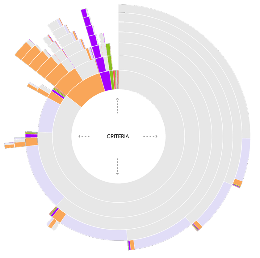
Zone analysis
At this point, I had a look at where users are clicking on the tool. I’m looking at how popular each mechanism of the tool is, how many of the users are going on to call in from the business (and from which criterion), and for general patterns in how the content and Information Architecture is being interacted with.

Data analysis
I delved into Adobe Analytics data. Specifically, I was interested in the number of views each piece of policy was getting and comparing this with the most popular search terms used - metrics I had arranged to be tracked with custom variables prior to the project commencing.
This helped me identify what topics people were searching for and allowed me to draw some conclusions abound whether they found what they were looking for - as well as simply understanding whether the names of the topics were appropriate for brokers.
CRITERION VIEWS
CRITERION SEARCHES
Journey analysis
Journey in
Entry points: How brokers accessed the tool.

Journey out
Exit paths: Where users navigated after.
Competitor analysis
At this stage, I looked at competitors in the market. Depending on the industry I’m working in, this will usually be a part of my process. In this instance the core user-base are brokers, who flit between intermediary lender sites to find and compare similar information, making this a particularly prudent step.
| FEATURES |  |
 |
 |
 |
 |
 |
 |
 |
 |
 |
|---|---|---|---|---|---|---|---|---|---|---|
| SEARCH |  |
|
|
|
|
|
|
|
 |
|
| A-Z | |
|
|
|
|
|
|
|
|
|
| CATEGORIES | |
|
|
|
|
|
|
|
|
|
| TOP QUERIES | |
|
|
|
|
|
|
|
|
|

Virgin
- Residential and BTL split with radio buttons
- Search feature and A-Z
- All criteria shown on one page tucked into accordions

Natwest
- Focus on broad categories
- Category pages have all of the relevant criteria on one page, with subcategory anchor links along the top
- Separate A-Z feature
Coventry
- Focus on broad categories
- Alphabetically sorted within those categories
- All criteria shown on one page tucked into accordions

HSBC
- Focus on broad categories
- Alphabetically sorted within those categories
- All criteria shown on one page tucked into accordions
The competitor analysis highlighted industry trends such as:
Usertesting
In order to dig deeper into pain points, at this point I ran a usertest with fact-finding tasks to complete. I went with straightforward tasks to avoid any leading questions.
I asked each question for both Accord and Virgin Intermediary lending criteria - alternating which one went first so as to ameliorate any bias with regards to familiarity with the task.
Participants were all brokers - most of whom would have used Accord already. This familiarity makes it more challenging to conduct fair tests on Accord - however, the initial questionnaire allows us to later segment users based on their baseline level of understanding. Participants were encouraged to speak out loud, and their sessions and microphones recorded as they went through the test.
Scenario examples - What is the lenders policy on this situation?
Initial questionnaire
- How often do you use the Accord lending criteria?
- How would you rate the lending criteria for finding the information you’re looking for?
- Is there an intermediary lender in the market that stands out as being the easiest to find information on lending criteria?
- Why is it easier with this lender?
Usertesting results
This usertest gave me qualitative data in the form of observable interaction with the tool and verbatim comments, but also quantitative data as I could compare mean task completion times, clicks and general success rates between Virgin and Accord.
Define problems
Design iteration
Using insights from research and user feedback, I began sketching various iterations in Figma. Early concepts focused on:
- Consolidated content presentation: Grouping related criteria (e.g., income-related policies) to reduce navigation steps.
- Standardized naming conventions: Started to consider how I could structure the information, and establish a unified lexicon to ensure consistency across the tool.
- Improved search functionality: Enhancing the search to return direct, contextually relevant results which were broad or specific, depending on the search terms.

At this po, I ran some quick usertests on quick prototypes of two of the concepts, just to sense-check my thinking.
Information Architecture & Content
It was apparent from some of the usertesting that a great deal of the issues in the current criteria stem from the structuring of the information, naming conventions, and duplication of content across multiple sections without a clear ordering system in place.
At this point, I leveraged deep subject matter expertise from Policy, Risk, and Underwriting teams to comprehensively audit, rewrite and restructure the lending policy itself. Whilst organising, I knew I had to create a system where criterion could appear in multiple categories. For example, a user looking for 'Loan size for Additional lending' might reasonably go to the Additional lending category or the Loan size category.
Technical
At this point in the project I started to engage the developers in the squad. I had an introductory session to go through my ideas with them, and I was particularly interested in the following:
- Is there a mechanism in the CMS to have a one-to-many categorisation of web content snippets?
- Is there a mechanism for web content snippets (our criterion) to be assigned a url and a page template? As manually creating and maintaining individual pages for each criterion might make this idea inviable.
- Can you explore the options available for search - particularly interested in hooking up the site search if we end up with an API-based application again. Also, the search must be able to search through contents and tags, as well as titles.
- Going through some accessibility checklists
- How long might all this take?
Thankfully, all of the above was possible out of the box with the CMS!
Prototype
Now that I knew my front-runner idea was viable, I set about pulling together a comprehensive Figma prototype which included all the pages I would need to repeat my usertesting with it. I was confident that I had fixed the problems that I had identified, and that the prototype would be successful. Of all the ideas I had mocked up, the feature that I was keen on was the top-level sidebar navigation. This kept the user rooted in the simple categories and ensured that any piece of content was only one click away at any given time.
Easily browse whole categories
Intuitive categories in Applicant, Loan, Property. This fit in well with the wider industry, broadly matched results from a card sorting test with brokers, and was agreed by the Policy team
Easily drill down to specific criterion
Categories with their own pages to browse with anchor index - eg Income page has all types of income to pick from
Shared criterion / One-to-many category system
Criterion shared between categories, eg Income > Additional lending or Additional lending > income. As well as catering for users that think about the concept from different angles (which seemed necessary from the card sorting excercise), this system is much more efficient for the upkeep of the site in future, which is better for ensuring accuracy
A-Z page kept as a separate method
Whilst the A-Z had clear flaws demonstrated in usertesting, it is still used widely in the industry and internal stakeholders were keen to have it. I decided to keep it as a separate glossary of all terms. This meant splitting up terms, adding multiple different names for the same thing, and picking out terms from within the criterion so that it was definitive.
Evidence criteria sits alongside the actual policy
An 'Evidence' box sits to the right of any criteria that needs to be evidenced at application, instead of having seperate evidence criteria content.
Search for specifics or categories
Search can look through titles and content, along with additional tags added where there are multiple terms in the industry.
Crawlable criteria, individual criterion pages
Now that the criteria content will be crawlable, it'll show up on-site search and search engines. And because criterion now have their own pages, very specific searches will bring back the exact query a broker is looking for, along with broader entries.
Search bar focus for accessibility
Usertesting
To test the proposed prototype solution, I embarked on another round of usertesting: the same fact-finding tasks but this time pitting the old criteria tool against our new prototype. A new panel of participants were targeted in order to avoid any bias from the initial test.
As before, the ordering of the new and old for each task was alternated for each task to avoid any bias.
Results
Minimum application age
Old
criteria
New
prototype
Mean time to complete
Mean clicks to complete
Reported ease to complete 1-5
Total score 1-10
Gross salary and evidence
Old
criteria
New
prototype
Mean time to complete
Mean clicks to complete
Reported ease to complete 1-5
Total score 1-10
Flying freehold policy
Old
criteria
New
prototype
Mean time to complete
Mean clicks to complete
Reported ease to complete 1-5
Total score 1-10
Valuation for additional lending
Old
criteria
New
prototype
Mean time to complete
Mean clicks to complete
Reported ease to complete 1-5
Total score 1-10
As you can see, the usertesting showed a significant improvement on all metrics for finding content - and this is despite testing with a group of users who are familiar with the control version.
Split testing
When launching anything of a certain size, I usually launch to 50% of users in a split test against the control.
This ensures a fair test that isn't susceptible to external events, and gives figures that can be relied on. I ran the split test for around 6 weeks and achieved statistical significance sometime before that.
Conversion rate
Call reduction
Criteria use per session
Iterate
Case study: Split testing
Split testing is my absolute favourite type of data. Sure, user-testing and the like have their place for sense-checking and validating ideas, but they are finger-in-the-air stuff next to testing on real users and observing real-life behaviour.
Aim
The aim of this project was conversion optimisation: I was just asked to identify areas most ripe for commercial improvement.
After researching the wider site and pulling some options together, I chose the navigation as my first package of work - not only is its impact on the site huge by virtue of its function on every page, a navigation offers a great opportunity for gaining an understanding of users behaviour and thought process through live testing. In addition, due to its high volume of usage, it's much quicker to gain statistical significance on an experiment compared to other site elements, allowing for extremely fast learnings and iterations.
Metrics
- Savings applications (start & submit)
- Mortgage applications (submit & approved)
Round #1
Looking at the submenus for mortgages and savings, they looked extremely cluttered. I knew I had the opportunity to test not just the menu itself but the journeys that we push customers through, and how that impacts conversions.
To do this, though, I first needed to cut through the noise of the current navigations, so I built some prominent tiles which would sit above the text links.
I configured the tiles in this way:
- Mortgages For the first tile I feautured Borrowing calculator, which was our default starting point to send mortgage users to. A very lightweight tool which allows customers to get a rough idea of how much they could borrow. I followed this with tiles to different mortgage types.
- Saving Each category of savings account
Hypothesis
Hypothesise that driving more users to savings category pages and mortgage calculators will increase conversions.
Test
By simplifying the savings and mortgage submenus and introducing tiles, we can drive users to these more direct journeys and test our hypothesis.Methodology
- A/B - 50% control, 50% new menu design
- Metrics are savings apps (start & submit), and mortgage apps (submit & approved)
- To run until statistical significance
A - Control


B - Variant


Winner: B
savings application starts
savings application submits
mortgage application submits
mortgage application approves
B yielded Savings conversion improvements, and negligent / statistically insignificant mortgage conversion improvements. B carried forward.
This round indicated to me that leading customers to category pages is a positive for conversions, and / or cutting through the noise of the large number of links in itself was also beneficial.
Round #2
Now that I had my tiles in place which cut through the noise of the rest of the submenus, it was time to take advantage of it and test which entry points were best.
Examining savings, there are two main entry-points for finding an account- Category pages, and the 'Savings finder' tool which lists and filters all accounts. So, I decided to test the latter being the most prominent item.
I also decided to test the naming of this page on the menu. Would users respond more to 'Find an account', or 'View all accounts'?
Hypothesis
Hypothesise that driving more users to savings finder will increase conversions.
Test
By simplifying the savings and mortgage submenus and introducing tiles, we can drive users to these more direct journeys and test our hypothesis.Methodology
- A/B/C- 33.3% of users see original details page, 33.3% B, 33.3% C
- Metric is savings apps (start & submit)
- To run until statistical significance
A - Control

B - Variant
C - Variant

Winner: C
savings application starts
savings application submits
C yielded incremental conversion uplift. C carried forward.
This round told me that customers marginally respond better to a promise of having all accounts laid out in front of them, and go on to convert more on that basis.
Round #3
Turning to mortgages, I now examined the key entry points for the mortgage journey:
- Borrowing calculator Very quick tool for finding out how much you could borrow with YBS. No personal data entered, not entered into any systems for follow-up comms, and the customer can't make an offer on a property with this.
- Get a Lending decision Quick tool for finding out how much the customer could borrow with YBS. The customer is entered into the system, we follow up to the customer with comms, and they can make an offer on a property knowing they have an offer in principle.
- Find a mortgage deal: The customer can find a mortgage rate based on the property amount and borrowing amount they would like. Really, they probably can't do this until they know how much they could borrow unless they aren't pushing their income multiples at all.
It struck me that Borrowing calculator and Lending decision gave the user the same information, but whilst a decision allowed the user to act and captured their details for later communication, the borrowing calculator did none of these things. On top of this, a user who goes through the borrowing calculator would then have to re-enter all of their details again in the Lending decision form to convert.
Based on this, the borrowing calculator was starting to seem redundant in the journey to me, and the commercial benefits of pushing more users through the Lending decision journey seemed large. I decided to test this theory, and ran a test where Lending decision was the primary CTA
In order to get even more learnings and test naming conventions and customers' understanding of the name 'Lending decision', I decided to also test a tile called 'How much could I borrow' which links to the Lending decision journey, as a third variant.
Hypothesis
Hypothesise that driving users straight into a lending decision application, where they get the same information but can also act on the figure presented, will increase conversions.
Test
By replacing the first tile 'Borrowing calculator' with a Lending decision tile, we can test our theory.Methodology
- A/B/C- 33.3% of users see original details page, 33.3% B, 33.3% C
- Metric is mortgage apps (submit & approve)
- To run until statistical significance
A - Control

B - Variant
C - Variant

Winner: C
mortgage application submits
mortgage application approvals
C yielded a large mortgage conversion uplift. C carried forward.
This result confirmed my suspicion that Borrowing calculator is a dead end for conversions, and pushing users into a Lending decision application is the best method to convert.
Round #4
Some time later I re-examined the menus. Using my learnings from before I had a good idea of which journeys to push users through, and I looked to simplify the menus and remove links:
- Simplifying & removing links I looked to zone analysis and consulted different areas of the business to push to remove any links which were not needed. I had been involved in a project to improve the help section of the website, so I knew I could safely move all of the help links to that section and have help as a top-level menu item, which would do most of the leg work.
- Lending decision to Decision in principle Doing some competitor analysis I noticed we were an outlier in the name 'Lending decision'. Our name for this had been changed a few times over the years, and it was a conversation that had come up many times. In the end following some usertesting the decision was made to align ourselves with the wider market and call it 'Decision in principle'.
Hypothesis
Hypothesise that simplifying the menus will reduce paralysis of choice, concentrate more users to core journeys and increase conversions.
Test
By simplifying the savings and mortgage submenus, we can further concentrate users to these more direct journeys and test our hypothesis.Methodology
- A/B - 50% control, 50% new menu design
- Metrics are savings apps (start & submit), and mortgage apps (submit & approved)
- To run until statistical significance
A - Control

B - Variant
Winner: B
savings application starts
savings application submits
mortgage application submits
mortgage application approves
B yielded some incremental conversion improvements. B carried forward.
This round was more about using our learnings to design something holistically that was tidy.
Final tally
At the end of the rounds, the results are positive.